All of these Contents Page are very different to each other yet have the same purpose. They all contain vibrant, eye-catching colours; each being consistent to their colour pallet. By being consistent to their colour pallet, this gives the impression to the audience that they're professional. There are imperatives used in all these Contents, not giving the reader/audience a choice but to go to that page and read it.
 You can immediately distinguish which
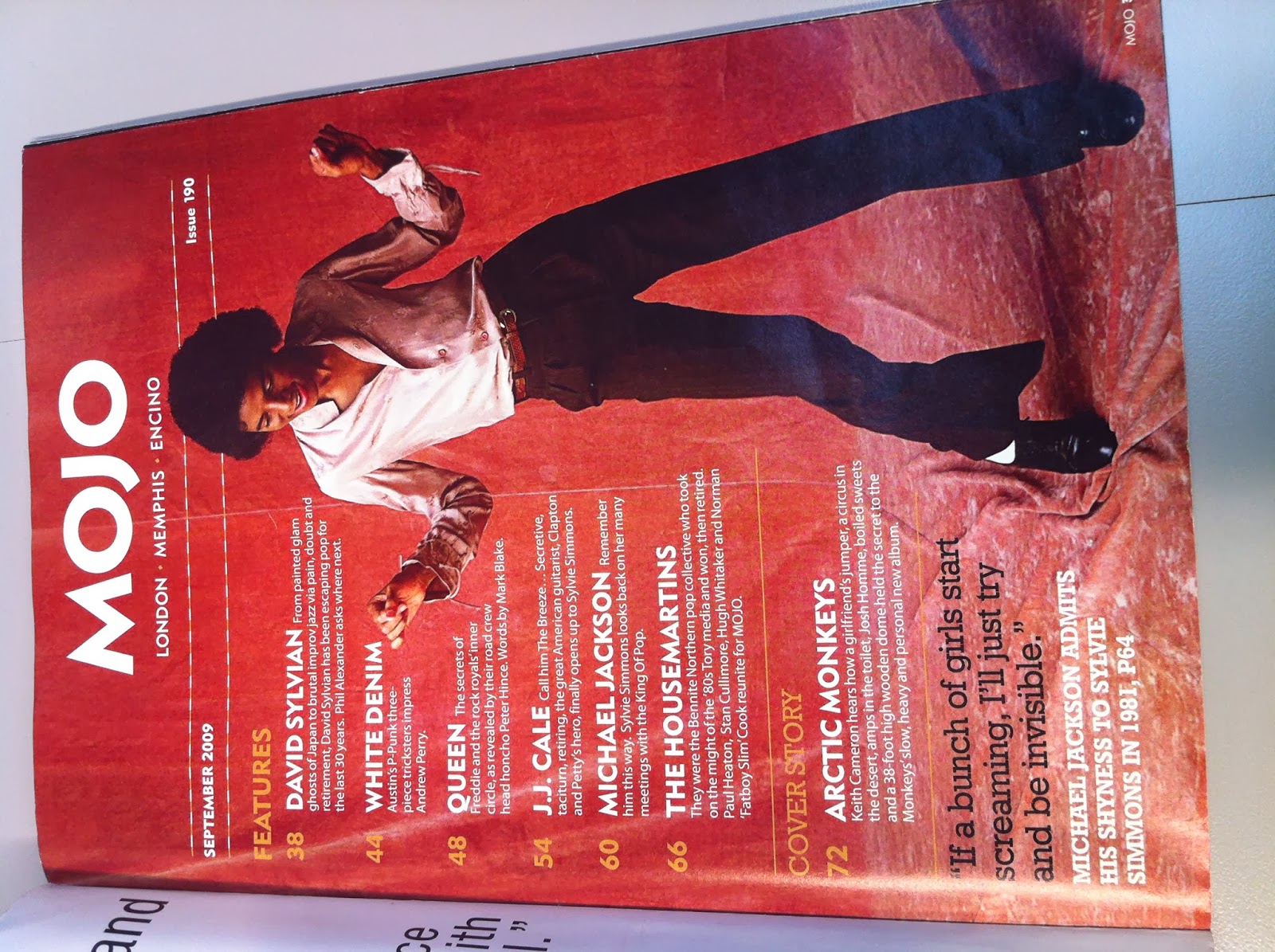
Magazine this page belongs to. The name at the top of the page, ensures the
audience that this is 'Mojo' Magazine so they are able to spread the news about
how great this Magazine is. This layout is different to the 'Q' Magazine's as
there is only one picture; which is on the right hand side. The picture is of a
famous figurehead whom everyone will recognise, as he is posing his signature
pose; people will feel more inclined to read it. Furthermore, the colours of
Michael Jackson's outfit coincides with the colour pallet of the Magazine. The
dark red background could be associated with clubbing and the era that Michael
Jackson ruled. Along side the left of the Contents page, there is a heading and
sub heading; informing the reader what the Magazine consists of. The page has
been consistent with the colour pallet and they used it effectively. There is a
balance between the colours that are being used, when the black is
applied; it suggests to the reader that they have to read it.
You can immediately distinguish which
Magazine this page belongs to. The name at the top of the page, ensures the
audience that this is 'Mojo' Magazine so they are able to spread the news about
how great this Magazine is. This layout is different to the 'Q' Magazine's as
there is only one picture; which is on the right hand side. The picture is of a
famous figurehead whom everyone will recognise, as he is posing his signature
pose; people will feel more inclined to read it. Furthermore, the colours of
Michael Jackson's outfit coincides with the colour pallet of the Magazine. The
dark red background could be associated with clubbing and the era that Michael
Jackson ruled. Along side the left of the Contents page, there is a heading and
sub heading; informing the reader what the Magazine consists of. The page has
been consistent with the colour pallet and they used it effectively. There is a
balance between the colours that are being used, when the black is
applied; it suggests to the reader that they have to read it.  At the top of the page there is a
bright red banner. This instantaneously attracts the audiences' attention, as
the same shade is being used for the 'Q' Magazine it shows that it all belongs
to it. Beneath the 'Q' Magazine Logo, is a picture of the Band Members; showing
the central attraction of the overall Magazine. Some of their heads cover the
'Q' Magazine Logo, which doesn't matter as this Magazine in particular is
famous. Along the right hand side of the page are reviews of a variety of
artists. This may suggest that the Magazine is versatile the way in which they
review different genres of artists; possibly to encourage people who like these
other artists to read this Magazine. The page consists of pictures and main
events/gossip. It is constructed in a professional manner and is very
consistent. Again, the yellow circle suggests that the information is vital as
the colour hasn't been used at all in this page (up until now). At the bottom
of the page, there is someone dressed in Indie clothes; which could give away
the main genre of this Magazine. The hat covering half of his face could suggest
a sense of secrecy or the model could be a timid character.
At the top of the page there is a
bright red banner. This instantaneously attracts the audiences' attention, as
the same shade is being used for the 'Q' Magazine it shows that it all belongs
to it. Beneath the 'Q' Magazine Logo, is a picture of the Band Members; showing
the central attraction of the overall Magazine. Some of their heads cover the
'Q' Magazine Logo, which doesn't matter as this Magazine in particular is
famous. Along the right hand side of the page are reviews of a variety of
artists. This may suggest that the Magazine is versatile the way in which they
review different genres of artists; possibly to encourage people who like these
other artists to read this Magazine. The page consists of pictures and main
events/gossip. It is constructed in a professional manner and is very
consistent. Again, the yellow circle suggests that the information is vital as
the colour hasn't been used at all in this page (up until now). At the bottom
of the page, there is someone dressed in Indie clothes; which could give away
the main genre of this Magazine. The hat covering half of his face could suggest
a sense of secrecy or the model could be a timid character. 
This is the Contents page from 'Fader'
Magazine. Again this has a different layout to the two previous Contents pages.
The picture is allocated in the top central half of the page, which attracts
the eye quickly. Naturally, the eye will glance down; thus leading them to see
the contents of the Magazine. This page applies itself to the colour pallet,
giving it a professional look. Also it is easy on the eye, as it is kept plain
and simple. By keeping it plain and simple, it'd be easier to read as lots of
random colours that didn't complement each other, would be jumping out at you.
The page number is on the top right hand side of the page whereas it is
on the bottom right hand corner in the other Contents pages. The image contains
the same artist that was used for the Cover, which shows the consistency and
the main central attention for this particular Issue.
From analysing these Contents Pages, it has given me ideas that I could incorporate into mine. For example, the ‘Q’ Magazine page has the Band on the top left hand corner (coinciding with The Golden Spiral); which is the first thing that the people will see. They have used vibrant, distinctive colours not allowing the audience to miss it. I like the whole layout of the Page; as it is unique and fulfils the whole meaning of what a Contents Page does.
No comments:
Post a Comment